Bootstrap grid primer for designers
While I personally prefer using with the 8-Point Grid System I’ve worked on projects where we are required to use the Bootstrap library and it’s accompanying grid. While developers love how easy it is to set up columns some designers tend to struggle with understanding how their designs will fit into the grid framework.
Grid Parts
To start with each grid consists of multiple parts.
Container
The container wraps the entire site with some extra margin/padding on the left and right to keep the grid from being flush against the sides of the viewport.
Each grid must have a container. Most of the time you only have one container.
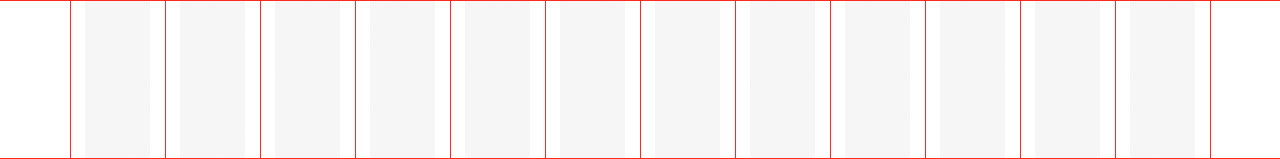
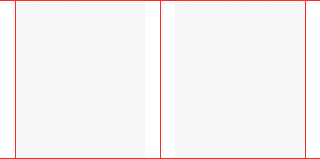
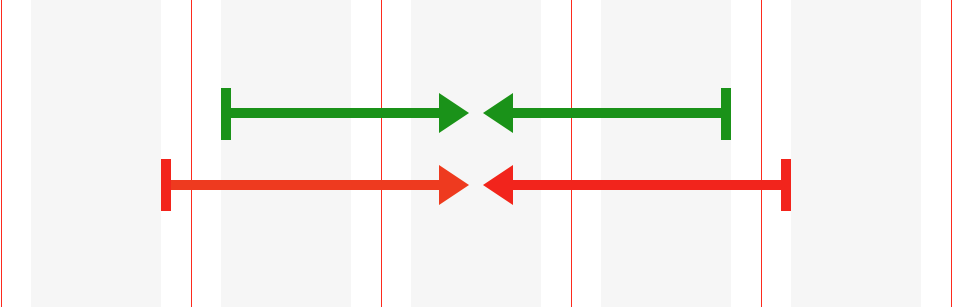
Rows
Rows are horizontal wrappers for columns that take up the full width of the container.
The row sets up the grid which consists of 12 columns on desktop and two columns on mobile.
A container will have multiple rows.
Desktop: (not to scale)
Mobile: (not to scale)
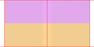
Columns
A column must be inside a row and the website’s content must be placed within columns.
Columns can span 1 to 12 of the row’s columns.
The rows column are denoted by the red vertical guides, while the gray area inside is the content. The extra space on the left and the right is the margin added by the container.
In this example the purple column is four row columns wide and the orange is eight.
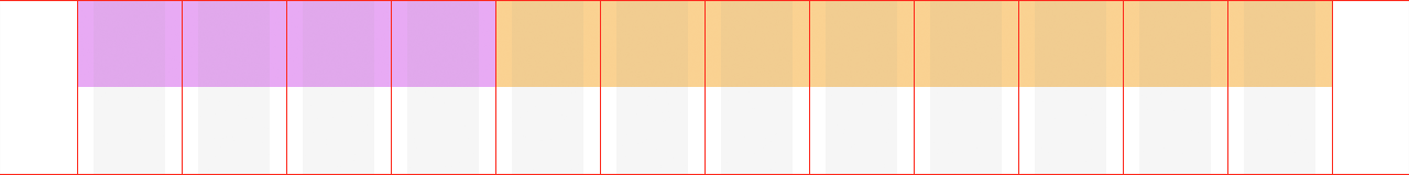
Note: If the width of your columns add up to more than 12 the last column will wrap onto a new line below the others.
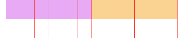
Gutter
Each column has horizontal padding for controlling the space between them and keep the content from touching its sides.
A gutter is 30px wide (15px on each side of a column). THIS WIDTH DOES NOT CHANGE and will always be 30 pixels on any size viewport.
Content shown in dark green. Note the padding/gutters on the left and right.
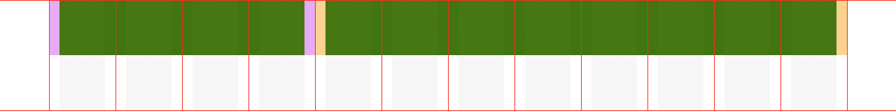
The content needs to start and end inside a column. It can’t be partially aligned with the next column.
Note: Gutters can be removed if you want content to be flush with one another; like in the case of images.
Breakpoints
The grid is fluid/flexible, so the columns (not the gutters) become wider or more narrow based on the width of the viewport. By default a column will shrink indefinitely unless you tell it to adjust.
There are set viewport widths where you have the option to adjust/rearrange how wide the columns are.
Extra Small
Less than 576px
Small
576px and up
Medium
768px and up
Large
992px and up
Extra Large
1200px and up
Note: YOU CANNOT ADJUST A COLUMN IN BETWEEN THESE BREAKPOINTS. For example you can’t change the width of the column at 1000px (between Extra Large and Large) you can only do that at 1200px or 992px.
Also Note: While we tend to think of a website starting at the desktop and getting smaller, this grid works the opposite and the breakpoints start small and go up
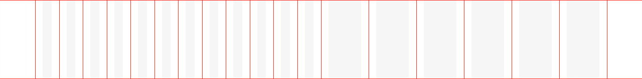
Example
To start when the screen is 320px wide (Extra Small) each column is full width so they stack vertically.
As the viewport gets bigger and hits 769px wide (Medium) you can change it so each column is six grid columns wide.
As the viewport gets even bigger and hits 1200px wide (Extra Large). You can adjust the columns again.
Nesting
This is where it gets kind of crazy. You can nest a new row inside of a column. Now each row sets up its own 12 column grid. So you may have a parent column that is six columns wide (half the site), but if you put another row into it you divide that half of the site into another 12 columns with 30 pixel gutters.
Reordering
The order of the columns inside a row can be changed at breakpoints.
Designing
This article of How to Master the Design Grid does a good job of going over the basics so I won’t re-hash it here.
Template Files
You can download a Sketch template with the different grid sizes here.
I recommend we use the 1200px (Extra Large) and the 320px (Extra Small).
And here is a good video intro on how to use them.
Documentation
If you want to get into the nitty gritty here is the full grid documentation.